Netflix Logo Design: The Sequel
/Originally published by Swarm Agency
Skeuomorphism. No, that’s not the name of an Alien attack movie, but is a design concept that is used to make digital applications or experiences resemble their real-world counterparts. It’s a design element that has been popular since users’ real-world lives began colliding with their digital lives. Its purpose is to give users visual and familiar cues so they quickly and easily understand the function behind the form.
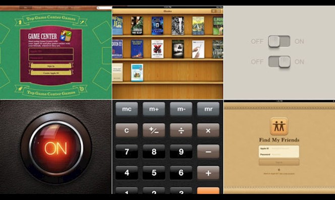
Here are some examples of Apple’s Skeuomorphic designs, which give off a familiar and less foreign vibe because they resemble real-world objects in a digital universe.
Fast-forward to 2016 where a whole slew of new app designs are going through an evolution, including Uber, Instagram, and now Netflix.
User-experience design is gravitating toward a visual language that speaks to simplicity. Netflix is the newest big-name, digitally-focused brand to jump on the brandwagon. It uses a more Metaphorical design language than a Skeuomorphic one. The beauty of its flat design is within its ambiguity. Is it meant to represent a red carpet? A ribbon that is “streaming”? The interconnectedness of the human race and digital services? Three strips of Big Red gum?
It maintains its recognizable black and red color palate, and brings to life a drop-shadowy, 3-D design that feels like you can nearly peel it off the page. The logo implements a beautiful z-axis design element to give the “N” depth without making it look clumsy. This new look helps it stand out in your app library and on social media; places where you have limited time and real estate to grab your audience’s attention.
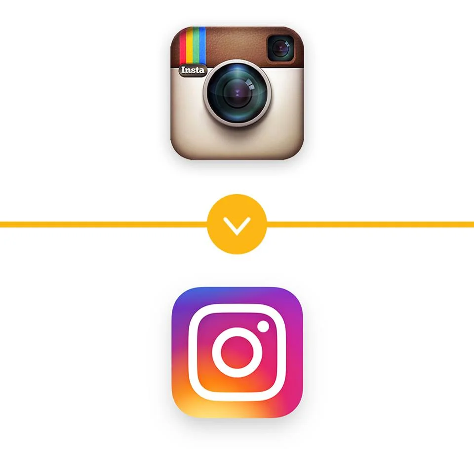
We asked Anna Smith, Swarm’s Graphic Designer, about Instagram’s design change that rolled out a few months ago. She said, “The beauty of [Instagram’s] old logo was that it was classic and unique; it used the shadows and skeuomorphism that most are afraid to use. This new logo assimilates with all the other flat, gradient-based designs out there, causing it to now blend in with the masses.”
Design territory is just as complex as a Game of Thrones episode, enticing us with the most recent battle between Skeuomorphic design versus Metaphorical design. Metaphorical design makes the leap that the user is intelligent, and doesn’t need as much hand-holding in the design framework. Now that consumers are more connected and familiar with digital than ever before, popular brands can be just as minimal in their logos as McDonald’s Golden Arches and Nike’s Swoosh logo.
It takes confidence to use a lettermark to tell the whole story of your brand within a 180px by 180px framework. If we could all be as recognizable as the first letter of our name (Oprah excluded, but thank you if you’re reading this), you would be a global force to be reckoned with. Lookout for the new Netflix logo coming to an iDevice near you.
Now, you can go back to Netflix and chilling.


